

Nov 10, 2026
Read More >>
Quick Answer
A mobile-optimized website helps Google access your content and helps customers use your pages on smaller screens. Google indexes the mobile version, and Core Web Vitals contribute to ranking, but mobile improvements alone do not guarantee higher positions.
A small screen can expose a bigger website problem
Pull up your business website on your phone and try to request an estimate. Is it easy to read the service details? Can you find the menu and fill out the form without zooming in or turning your phone sideways? Even if everything works on a desktop, using your site on a small screen can be a totally different—and sometimes frustrating—experience. If you run a business in Columbia or Lexington and care about people finding you online, this really matters. Your mobile site should give Google all the important details it needs, while also leading your visitors smoothly from finding you to getting in touch. These goals go hand-in-hand, but each is measured differently.What Google actually uses from your mobile website
Google now uses the mobile version of your website to decide how you show up in search. That means your service descriptions, headings, images, and links all need to be easy to find and use on a phone. A responsive layout helps your site adapt to different screens. But just shrinking a desktop design doesn’t mean your site is truly mobile-friendly when it comes to content or speed. If your mobile page skips important service details, Google—and your customers—won’t get the full story of what you offer.Collapsible sections are great for organizing long pages—just be sure Google can see what’s inside right away. Don’t hide your most important info behind a click.
Check service details across screen sizes
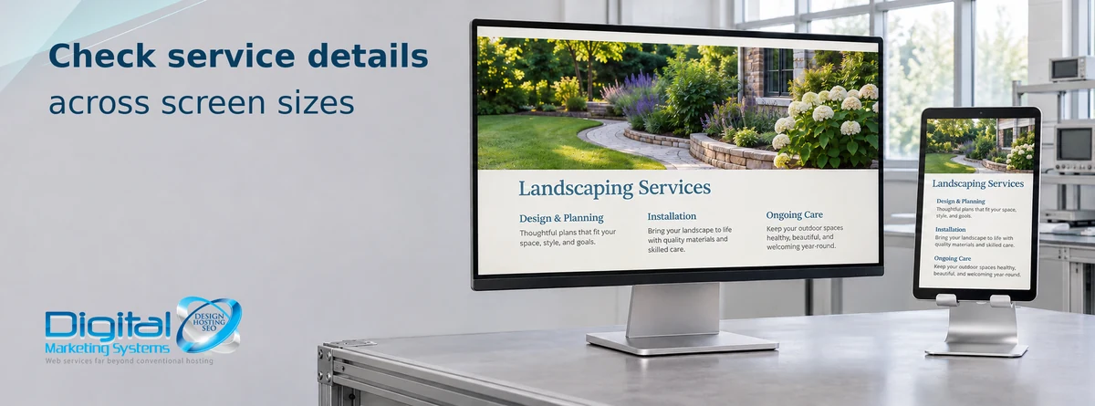
Pick your main service page and look at it side-by-side on a computer and a phone. Begin at the headline and work your way through to the contact section. Double-check that your service areas, qualifications, images, and related links all still show up when the page gets smaller.
Let’s say your business covers Lexington and West Columbia. If your desktop site mentions this but your mobile version leaves it out, people on their phones won’t know. Always keep important info consistent, even if you rearrange it for smaller screens. Our website design services can help you bring your content and layout together.
Speed and stability need their own checks
How your site loads on a phone matters too. Google looks at things like speed, how fast the page responds, and whether things jump around as it loads. These Core Web Vitals scores are helpful, but they aren’t the only factor in how high you’ll show up in search results.
Clear, helpful descriptions are what your customers are actually looking for. Better scores won’t fix missing info or a page that’s off-topic. For a bigger-picture solution, our SEO services connect your technical fixes with what people are really searching for.
Start by looking at big images, unneeded scripts, and page elements that shift around after loading. Set image sizes so your text doesn’t jump. Run PageSpeed Insights to check your main pages, and look at real-world data in Search Console. Testing is just a snapshot—after you make changes, test again and see if real visitors notice the difference.
Test the contact form with the keyboard open

Getting found in search is only half the job. Pull up your site’s contact form on your phone and try typing with the keyboard open. Can you easily read the labels, see any errors, and reach the submit button? These little things make a big difference to your customers.
Send a test inquiry and make sure you actually get it. If you can, try it on a different browser, too. Just because a form looks good in a screenshot doesn’t mean it works for real people. These checks protect your customers’ ability to reach you, even if they don’t change your rankings.
Before you spend money to drive more visitors, double-check your most important pages already work for the people coming to your site now. Ask Digital Marketing Systems to review your mobile website—we’ll start with the service and contact pages your customers rely on most.
Frequently Asked Questions
Is a responsive website automatically optimized for SEO?
Responsive design adapts the layout, but you still need useful content, crawlable links, reliable loading, and a contact process that works on small screens.
Should I remove service details to shorten my mobile pages?
Keep important service information consistent across screen sizes. You can rearrange it or use collapsible sections, provided their content is available when the page loads rather than fetched only after a click.
Will a better mobile PageSpeed score guarantee higher rankings?
No. Core Web Vitals contribute to ranking, while relevance and other signals still matter. A laboratory score is a diagnostic result, not a ranking promise.
Which pages should a small business check first?
Start with your main service pages and contact page. Follow the whole inquiry process on a phone, test with the keyboard open, and verify that submitted messages arrive.